In the latest episode of WEVO Exposed, we looked at Bose’s online soundbar purchase experience. Although the journey was found to be highly effective, some visitors found that there was too much irrelevant information on the pages, making the journey less intuitive than they might’ve liked. Watch the full video here or read on for key insights
Understanding visitors’ expectations is an important first step in understanding how effective a digital journey is. WEVO uncovered that the most common expectations of visitors coming to look for a Bose soundbar were that the product would have high quality sound, and an affordable price. Most visitors felt that these expectations were met, however 20% of visitors who expected an affordable price said their expectation was not met.
“It was fairly expensive without telling me why it’s worth it” said one visitor of the Bose Smart Soundbar 700.
Bose may want to emphasize their higher quality over competitors to make sure visitors see the value they are getting.
Next, let’s look at how intuitive the journey is. The Journey diagnostics that WEVO scores are Valuable, Trusted, Inspiring, Intuitive, and Satisfying. “Intuitive ” is Bose’s lowest journey diagnostic score and therefore the area that needs the most improvement. WEVO allows you to see real user quotes about your experience. Many noted that the page had too much information to digest, Here is what a few visitors had to say:
“It’s just one long page with lots of disjointed information”
“There is a lot of information everywhere and I was overwhelmed by it all.”
As we can see, there is an opportunity to remove some of the irrelevant information to improve visitors’ experience.
WEVO Journey tests also include insight tests on individual pages. We tested Bose’s homepage and soundbars page and uncovered some very interesting insights.
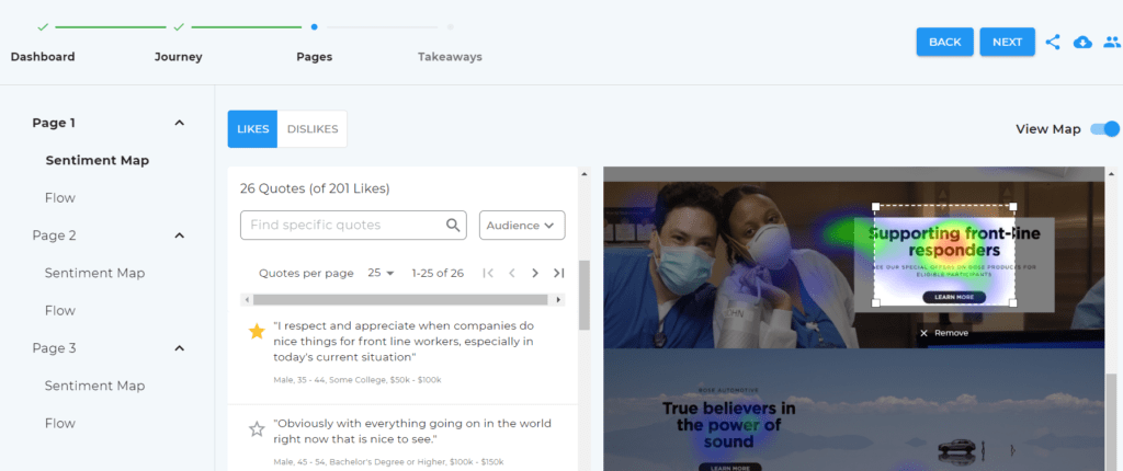
WEVO’s sentiment maps indicate which sections of your page garnered the most positive or negative reactions. The section of the Bose homepage that had the most positive reactions was the block about Bose’s discounts for first line responders.


“I respect and appreciate when companies do nice things for front line workers, especially in today’s current situation”
Visitors clearly appreciated Bose giving back to the community, even for visitors who are not first responders, this section helped them feel a connection to the brand.
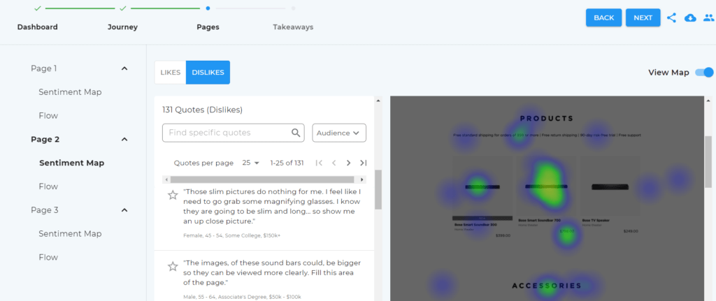
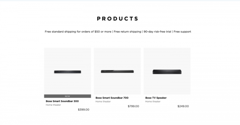
On the other hand, the section of Bose’s soundbars page that garnered the most negative reaction were these small images of soundbars.


“Those slim pictures do nothing for me…I know they are going to be slim and long…so show me an up close picture”
“The photos are WAY too small. They should be 10 times bigger at least”
As an important part of the journey, and the main purpose of visitors coming to this page, Bose may want to consider enlarging the images of their soundbars.
The final analysis that WEVO provides is “Flow”, which tells us whether visitors would be interested in continuing on to the next page, or the next step of the journey, based on what they’re seeing on the current page. Most visitors said they would want to continue their journey after the Bose homepage. Still, one of the visitors who did not wish to continue their journey said
“It’s way too busy, I have to work at searching things and then still have to hunt.”
Based on this feedback, Bose may want to simplify their homepage to feature only key information to make things easier for visitors.
Overall, BOSE’s journey works well for most of their visitors. But as with any digital experience, there is always room for improvement. Looking to get insights from your audience on your own digital experiences? Contact WEVO today.


